Student work
graphic design 01
Project 02
This project asked students to select a prominent designer whose style they were interested in learning more about. After a period of exploratory research on the process and craft of their chosen designers, each student was tasked with creating a set of six icons in the style of the their chosen designer.
This student chose the designer Aaron Douglas, and was inspired by his intense dedication to various civil rights struggles, particularly those relating to sexual/gender queerness. In so, this student chose to create icons centered upon female health and wellness. Additionally, the color palette is derived from the cover of Douglas' Black, queer publication, FIRE!!
This student also chose Aaron Douglas as their designer to emulate, but chose to focus more exclusively on the style and communication. The student chose to create icons which could be featured in a Japanese fish market. Knowing that good icons can communicate cross-culturally, this student sought to create icons that would be digestable by a
variety of cultures.
While students were not required to choose a theme, most had an theme emerge naturally through the iterative process of project ideation. Notably, the most successful attempts at this project all adhere
to a theme.
Across most of these students' submissions for this project, I noticed a respect for the culture and influences of the designers which they chose. With each of these students came discussions about what it meant to be emulating designers of color — what might be appropriative instead of commemorative? What impressions might members of these respective communities to which these designers belong have when viewing these icons, and knowing who created them? I'm thankful for my students' willingness to have these conversations, and even more thankful for the respect that they hold for these designers and their lived experiences.
This student also chose Shigetaka Kurita as their chosen designer. Instead of focusing on icons that Kurita prioritized in his initial batch of emoji (business, communication, commute, etc.), this student chose to celebrate a facet of Japanese culture — the theatre mask.
Project 03
In this project, students were asked to select both a cause/topic that they wished to investigate, as well as a practice of graphic design that they were curious about. After selecting these two items, students were given four sets of questions to go over. These question sets borrowed from the realm of critical race theory are as follows —
researching the self
self × topic
engaged reflection + representation
applying findings
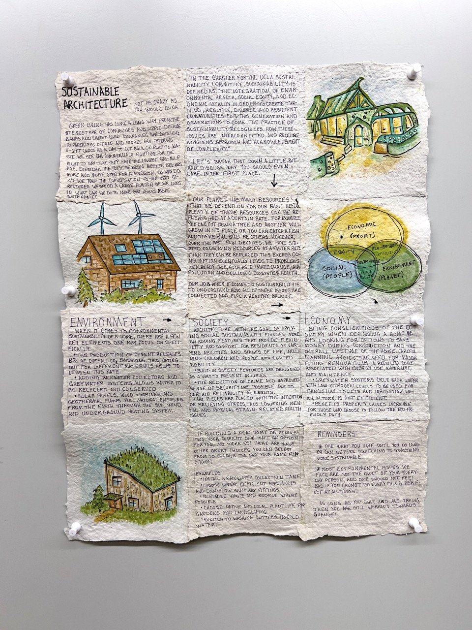
This student chose to research various ways in which architects can begin to make their plans more ecologically sustainable.
A student of architecture, it was great to assist a student outside of our discipline find ways to strengthen their home practice through materials and processes known to graphic design. Seeking to make a ~18''×24'' poster that was an artifact of the sustainabilty they wished to educate others on, this student handmade the paper, used paints, inks, and fixatives that are environmentally friendly.
I noticed a couple things along this project's course — one, that my students became more enthusiastic about graphic design, and two, they were more willing to share parts of themselves that otherwise might stay obscured. I like to think that these two observations are related in that becoming more familiar with graphic design as a potential extension of themselves through authorship would allow them to share themselves more readily and authentically.
This student chose to investigate their relationship with generalized anxiety disorder. The symptoms which they felt weighed most heavily upon them were the physical — shortness of breath, chest pressure, acute awareness of one's body, etc.
This piece is accompanied by a video component which can be viewed here.
This student chose to make their anxiety an interactive experience by creating a suit which simulates these symptoms of anxiety through simulation. Shortness of breath caused by the weight of the suit, chest pressure simulated through the elastic binding, and an acute awareness of one's body heightened through the wearer becoming indeterminately more rotund.
This project sought to teach students how to self-initate projects using materials and practices of graphic design. Many of these students come from a studio art background, and are familar with experimenting with drawing, painting, etc. in their free time. I wanted to show them that graphic design and its tools can be played with and explored in a similar fashion.
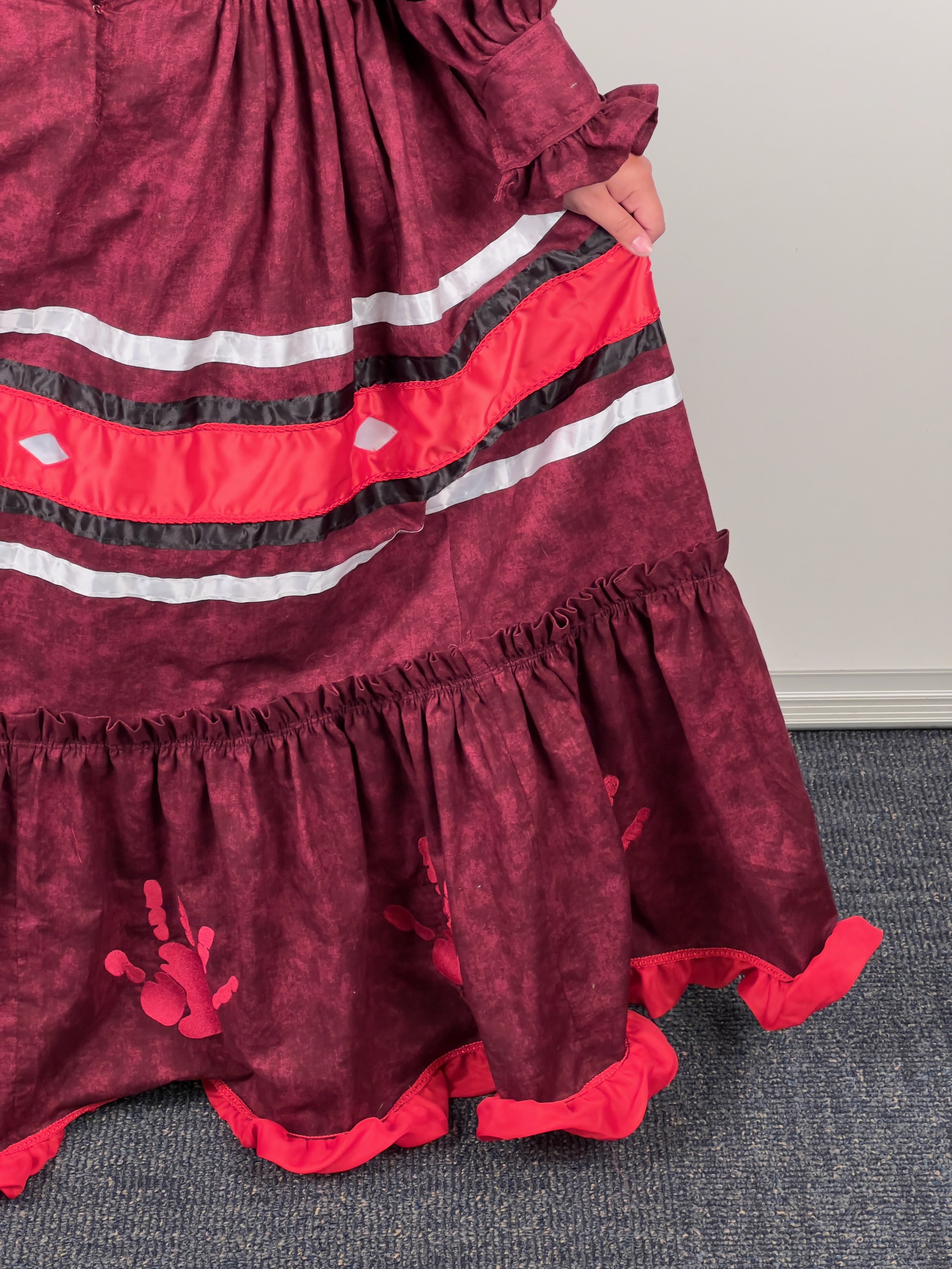
This student chose to research and commemorate missing and murdered indigenous women through the creation of a traditional Cherokee tear dress. This student had prior experience with sewing, but hadn't created a garment before, let alone one with such detail. She ideated visually by drawing the patterns and exploring colors for the dress in Adobe Illustrator, and then proceeded with its creation via
her sewing machine.
It was an honor to serve as an advisor/instructor for this project. This student learned more about her legacy as a citizen of the Cherokee nation, and learned more about how this for of expression has been passed down through generations of indigenous women. In her instance, from her grandmother to herself. As an instructor, students learning more about themselves and their place in the world is of the utmost importance to me.


