←PERSONAL WORK
The 27th Letter — Ligature
Objective
Our goal is to observe the similarities and differences of the parts of letterforms of a selected typeface using the Roman letter as a model. To design a 27th letter that is either an ampersand, a prefix, a suffix or two letters bound together as a ligature.
This 27th letter will become a major element in the poster that you design, so read ahead to that assignment because it will influence the design of the liga- ture/27th letter you create.
The three typefaces that I chose were Lubalin Graph Book, ITC Garamond Book, and Didot HTF — M11 Medium. I made a point to choose three serif typefaces with distinct characteristics: Lubalin Graph’s geometric emphasis, ITC Garamond’s dramatic fillets, and Didot HTF’s high–contrast strokes.
I eventually chose Lubalin Graph since I thought that it would be a great opportunity to experiment with how a slab serif manifests itself in a ligature. Lubalin Graph’s geometry limits the “play” in the inter–letter space that is seen in more traditional serifs, so I was — and still am — unsure of the efficacy of a ligature being used in the typeface. During this time we also gathered potential ideas for sets of letters to combine for our ligature. I decided to use the suffix, “–ity” due to its use of two vertically emphasized characters followed by a diagonally/ horizontally emphasized one. I felt this set would further challenge me to find the right chemistry between a similar left–half and dissimilar right–half of the suffix.


Create 15 to 20 black marker sketches for individual ampersand for chosen typeface. Strive to use no more than 4 strokes in the creation of each example. Pick 3 to 5 of the best sketches and recreate digitally at 300 points or larger.
I took to making the sketches in a more precise manner than the recommended four strokes due to variances in Lubalin’s geometry that would arise in simple sketches serving as a distraction from the spacing of the elements of the newly merged letters. After 17 pen–and–ink sketches I decided to move to the computer in order to iterate the ligature faster and more accurately.

The 27th Letter — Poster
Design a large format vertical color poster, 18"x 24" that pays tribute historically to a type specimen page that introduces the new, 27th letter from the previous project. Learn to organize disparate kinds of information using examples of letter, punctuation, set text etc. to teach a graphic design audience about the new 27th letter.
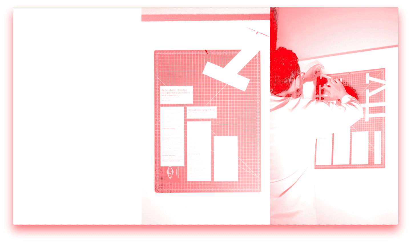
The 27th letter that I’ve produced in the previous part of this project is a ligature combining the letters i, t, and y within the typeface, ITC Lubalin Graph Book. Having already made a letter–sized type specimen page I decided to take this opportunity to explore the creative processes of Herb Lubalin as well as my own. What is presented is a deconstruction and marriage of our two modes of creation. The process for this project does not follow the typical sequence of Lubalin or I, resulting in a more thorough investigation into how the designer creates.

Prior to setting the rules for this project as mentioned above, the project began with my usual process, involving the direct creation of a 18" x 24", inkjet poster. To do this, I began setting blocks of headings, subheadings, captions, body copy in various sizes, weights, leadings, and trackings in Adobe InDesign. The blocks were then printed, cut into their desired dimensions, and placed onto an 18" x 24" cutting mat in order to construct a single composition. This new composition was then photographed, cropped to 18" x 24", and printed out. The decision to use a cutting mat as the surface on which to create this poster was due to two things: my board is the exact dimensions requested in the project’s design brief, and the cutting mat is the surface on which main designers forge their elements for use in a more refined setting; a focus on the cutting mat immediately creates a connotation of process.
The result of this process represented the ligature in an interesting and dynamic manner in print, but proved to be somewhat void of reason in terms of relating back to the typeface, its designer, and me as well. Additionally, the image treatments used in this draft seemed to only aid in my refinement of a method that I’ve used before this project.
I began reading the biography of Herb Lubalin by Gertrude Snyder and Alan Peckolick. In this reading I found a few passages that aided me in my process. I learned that Lubalin was not the best of students, only gaining entrance to Cooper Union by the skin of his teeth. I also learned — rather coincidentally — that Lubalin often initiated his projects on 18" x 24" tracing paper. As this dimension began to appear more frequently, it solidified the need for its presence throughout the work. I also found a reference to what could be considered Lubalin’s reasoning for the creation of ITC Lubalin Graph. The biography speaks of Lubalin, stating, “He stretched it, pulled it, tore it, and when it resisted, he redesigned it.” This quote provides precedent — or maybe evidence — for Lubalin’s reason for turning his famous Avant Garde into the slab–serifed itc Lubalin Graph. This quote serves my needs as well as I also am editing, reworking, adjusting my intent in the creation of this project. I also collected David Bird’s obituary for Lubalin, featured in the New York Times, for use as body copy in the piece.


I began this new attempt at the project the same way I began the first, but with the newly collected content. I nailed my cutting board to the wall and began the process of pasting up a block of content, photographing it, and repeating this process to my satisfaction (to exhaustion?).
Collecting 68 images, I created a stop–motion graphic, which features slight imperfections such as variances in the alignment of the board and camera, emphasizing the haphazard nature with which the composition was pasted
and removed; an exercise in viewing the formation of a layout as an abstract exercise as opposed to one of determining a specific hierarchy of content. I color– corrected this image sequence to feature only the trademark green of the Alvin cutting mat, blurring many of the variances seen in the environment’s multiple instances of “white.”
While performing this exercise, I recorded the process on a second camera. This footage was sped up to eight times speed and con- verted into 15 frames per second in order to not mimic the stop motion sequence, but to appear more visually related to it. This footage was also color corrected in order to increase the visual relationship.
The next step in my process was to select the images that could be traditionally considered “drafts” in terms of the their complete set of information as well as layout. Seven of the 68 images appeared to fit this category, so I cropped them to the boundaries of the cutting mat, sized them to18" x 24", and tile printed them on a laser–jet printer as if they were destined for a first critique. After assembling the prints, I then performed Lubalin’s 18" x 24" tracing paper sketching process atop each print, resulting in another image sequence, but this time in the analog. The 14 images are meant to be interacted with by the viewer at their own discretion, whereas the other two image sequences follow their own time intervals.
Process, process
The left–to–right order is subverted in this in- stance; the left–most being the final as opposed to the initial. However, the left–most also appears as the final in the sense that it was the last artifact created in this endeavor, as well being symbolic of the often desired final form for a critique of a poster, a tile print. The projection sits on the edge of our studio’s pinup space, replicating its positioning from earlier in the process.

Traces & Tile prints from the left third of the composition. View the motion component here.